Pages

Wig Work With Seema Chopra

Seema Chopra with Madam Peripetie, taken from www.seemachopra.com

Had the amazing good luck of a workshop with the amazing wig artist/dresser, Seema Chopra. She has an amazing skill and I learnt a lot from her. Unfortunately my skills with natural hair will most likely never be able to match her talent.

Just looking at her shoots with Madame Peripetie is inspiring! Such gorgeous design from costume, to make up and more importantly, the wigs and hair pieces.

Seema Chopra with Madam Peripetie, taken from www.seemachopra.com

Seema Chopra with Madam Peripetie, taken from www.seemachopra.com

The previous two images are so amazingly 'Wild Kingdom'esque it is untrue. Such gorgeous work! I especially love the hair piece in the second image. Put together on the day with only a headband, crepe hair and copydex glue, Seema is a true genius! 
The make up in that same image is truly stunning as well. The effect on against her skin is incredible!


Image I found through google for experimentation with Seema Chopra. From www.hji.co.uk

I found this random image on the day of the work shop, and haven't been able to find it since :/. Thank goodness for watermarks on images! I'm sure someone will be able to find it on their website! It is an amazing hair piece... I wasn't quite up to scratch...

My attempt at the image from www.hji.co.uk, with Kat Armstrong

... My attempt on recreating it on Kat didn't go so well, even with Seema's help. I ran out of hair, even with the extensions I put in, and then ran out of time! But I'm so glad I got the oppurtunity.
We all agreed that if I was to do this again, it would be best to create the look as a full hairpiece and just pop it on the model on the day.

SO MUCH FUN THOUGH ^^

Rough Lil Snaps of the Results!!!

Here are a couple of quick unedited snaps from my shoots:


Delon in his test shoot as my runway model

Delon was an obvious choice for a model. As a large, toned, black male with a face for the runway, he worked amazingly. His dark skin tone meant that the make up worked extremely well. 
As his brows were so dark, I didn't add the black definition which was shown on the face chart, but that was the only real modification I made to the design once in the studio.
The pattern I designed on his chest was made with a topless walk in mind. The stripes continued up his neck to behind his ears so that some design would be showing if he had had to wear anything on his torso. 
Delon's hair was cut so short that I left it free of design. I had contemplated combing out his hair so it was a little larger, but decided it would look too messy. The cut he had was already a little rough around the edges and if it was any less refined, I think it would have made the entire look too messy. 
I think it came out really well as it was.

Though my shoot with Delon would be for the runway, I think he would have looked amazing next to Emma, my editorial model. The contrast of their skin tones next to each other, with their complimentary make ups could have looked exceptional in one image together.

Rough shot of Emma, my pale tribal Princess
I chose Emma for her pale skin and dark hair. The 'Snow White' quality to her played in excellent contrast to the tribal aspect of the design and kept it from looking too 'Wild' in my opinion. I think this contrast of culture and race is common in high fashion, as it is so intriguing.
The only modification I made to the design I had planned once in the studio, was to not add the black defining line to the eye socked. Emma's eye shape meant that the addition of this would have closed in her eyes, and made the viewer focus too much on the upper part of her face. Without it, I think the design is a lot more balanced.
If I was to shoot this again, I think I would create a hair piece to add more interest.

Editorial Design

 Here is the design I have decided on for the editiorial look on the theme 'Wild Kingdom'. I have the horrible habit of just doodling all my ideas, but this was the only one that seemed worthy of a full face template. I just fell in love with the idea of it; how the colours compliment the runway look so well, and it incorporates the 'scarification' body design work. 


The outlines in pencil down the nose and on the inner and outer corner of the eyes represents white shapes drawn on the face. The red sections of the face are to be done in the same way as in the runway look, with an almost dry brush loaded with aqua colour. 
The base is once again, plain, removing all discolouration and blemishes only, keeping it matte. The brows are black, and follow the natural shape of the model's brows. They are more square at the middle, and feather at the end, using the same kind of line as those in the body paint.
The top lip is to be all black, with the bottom only outlined in black. 
The red paint will be worked into the hairline both at the temple and at the ears, where the contouring streaks cross the cheeks. 
The painting on the neck will only go to the sternum, and will fade out like a dry brush stroke.


Hair is where I am stuck. I know what I want it to look like, but it will remain to be seen on the day how the look will finish. If it is how I want it to look, the best choice will be the top left design. I will curl the entire head with a curling wand (NOT A TONG!!!!), leave to cool, and then brush out and add a slight back comb to make it huge. As my model will be very fair skinned, it will be my version of a white-girl fro, with the curls still defined, but blown out.
The hair will be drawn away from the temple in twists though, so that you see the detail on the forehead.

The Mash Up

Make Up for Runway

Face Chart for Runway Look for Females
The base of this look, for both males and females, would be very plain to keep the red, black and white looking bold on the runway. The eyes and lips will be free of colour, only prepped with the base to keep them muted.

I want the red areas of the face chart to look as though painted on to the skin with natural elements. To do this, I tested layering streaks of aqua colours, adding highlights of lighter shades over it.

Although I think this look would look good on all models, to keep them looking individual, the red could be changed to a variety of earthy tones, and the placement of the streaks can be moved around the face. I.e: for fairer skin, a deep orange could be used instead of the red. Or for a fuller face, the streaks could be moved to the hollows of the cheeks to create added contour.

Hair Designs for Females - Changes depending on natural hair type
To keep the 'tribal' aspect of the hair, I want to keep it looking 'natural', as though it had been untampered with. To do this, the hairstyle for women would change depending on their natural hair type. As seen in these sketches and annotations, I have designed four key looks, which would work for almost all demographics of womens hair. 
The hair stylists behind the scenes, would work to these four designs for all the models, using their natural hair colour.

Notes on the Body Art for Models - Same for both male and female


 For the body, I have modified the body painting I did for the scarification. Using streaks or blocks of black, red or the base colour of choice used for the streaks on their face, the Make Up Artist would create individual patterns on each model.
The placement and shape of the blocks painted on to the body would vary, based on the model's wardrobe for the show, body type and hair style chosen for them.
The streaks would be drawn in a similar way to those on the face, to have the effect of a dry, streaky paint on the skin.
The design overlaid on these will be the same collection of scores on the skin, and stripes between them. The colour is down to the artist, again, the choice of white, black or the red tone used.


Scarification

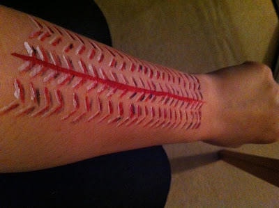
In session at uni today we looked at the act of scarring oneself and tried to replicate it on our skin using rice, popping corn and latex! The effects were stunning!

I can't find my images of what I created :/ I'm a little worried! I may need to redo them on myself to show you properly how awesome it looked!

After watching this on National Geographic's YouTube channel:


...I was completely hypnotised by the easy slicing of the skin, the way in which the practitioner made perfect scores into it, all of them the perfect length and distance from each other.

It inspired me to try this.


I used a similar pattern to the one that Benin had cut into his skin in the video. I used the red to show the blood, and added the white and black to make it look as though it was truly a cut into the skin. Of course it was more for impression, for artistic licence than for realism.

I like how it came out. Because I used aqua colour and an angled brush, the original red lines were neat and sharp. The white and black I added, however, were deliberately less so, to keep the hand-crafted, finger painted style that one would associated with "tribalism"

"Skin Shows III"

Some photos from "Skin Shows III", a tattoo archive of sorts, by Chris Wroblewski.

Flicking through I took poor photos on my phone (sorry about that) of all the tattoos that had a "Tribal" quality to them! Some of them are amazing! 


I love the use of bold black in all of them! The solidity and intensity is gorgeous! I love that in this one there is a face etched with the twisting shapes!
Looking at it at first, I thought that it looked almost oriental with the curves it used, but now really brings to mind a maori warrior like the one I showed here :).


I don't know if this one can count as 'Tribal' really. For some reason, I feel that the Native American history that has clearly inspired this woman's tattoo is more of a culture of a people rather than lone tribes people.
I don't know if thats a fair comment. I need to look further into it!


Now this one, is most definitely not a tribal tattoo in its design. However, its ETHOS to me is what makes it tribal. The idea that one can cover oneself with a bold pattern and clear display of self like this, is what links this man to the hundreds of thousands of tribesmen who have decorated themselves over the centuries!
It's simplicity lends to that!